Why Most Event Posters Fail (And How to Avoid It)
Ever seen a community event poster crammed with too much text, clashing fonts, or blurry images? Yeah, me too. And let’s be honest—those posters don’t work. They confuse people, don’t create urgency, and worst of all, don’t drive attendance.
The good news? Making a great event poster is easier than you think. You don’t need a graphic design degree or expensive tools. You just need to focus on three things: clarity, visuals, and calls-to-action (CTAs). Let’s break it down.
1. Start With a Clear Message
The most important question your poster has to answer is: What’s in it for me? If someone can’t tell what your event is about in 5 seconds or less, they’ll move on.
Key Details to Include:
- Event Name: Keep it short and descriptive (e.g., "Annual Community Potluck" vs. "Join Us for a Fun Gathering of Food and Friends").
- Date & Time: Use bold fonts and place this near the top.
- Location: Be specific. If it’s an online event, say so.
- What to Expect: Bullet points work great here. Examples: "Live Music, Local Food, Kids' Activities."
- Ticketing Info: Free? Paid? Pay What You Can? Make it clear.
Pro Tip: Use Hierarchy
Not every detail needs equal attention. The event name, date, and CTA should be the biggest elements. Secondary details like a tagline or sponsors can be smaller.
2. Make It Visually Appealing (But Not Overwhelming)
Your poster’s design should grab attention without making people squint. Here’s how:
Fonts:
- Stick to 2-3 fonts max. Use a bold sans-serif for the headlines and an easy-to-read serif or sans-serif for the details.
- Avoid overused fonts like Comic Sans or Papyrus—they scream amateur.
Colors:
- Use contrasting colors to make text pop (e.g., white text on a dark background).
- Match the color scheme to your event’s vibe. A cultural festival? Go vibrant. A formal gala? Stick to elegant tones like gold, navy, or black.
Images:
- High-quality images are non-negotiable. Blurry photos make your poster look unprofessional.
- If you’re short on visuals, consider free stock photo sites like Unsplash or Pexels.
3. Add a Strong Call-to-Action (CTA)
Your poster isn’t just for decoration—it’s a tool to get people to act. Whether it’s buying tickets, RSVPing, or sharing the event, make the next step obvious.
Examples of Effective CTAs:
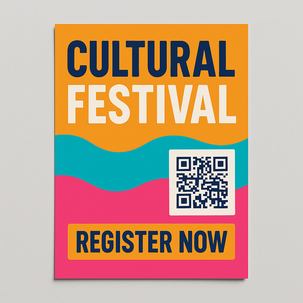
- "Scan the QR Code to RSVP Now!"
- "Buy Your Tickets at communitytix.org"
- "Join Us! Limited Spots Available."
QR Codes: Worth It?
Yes, but only if they lead somewhere simple and mobile-friendly. For example, link directly to your event page where attendees can RSVP or buy tickets in just a few taps.
4. Pair Your Poster With a Digital Event Page
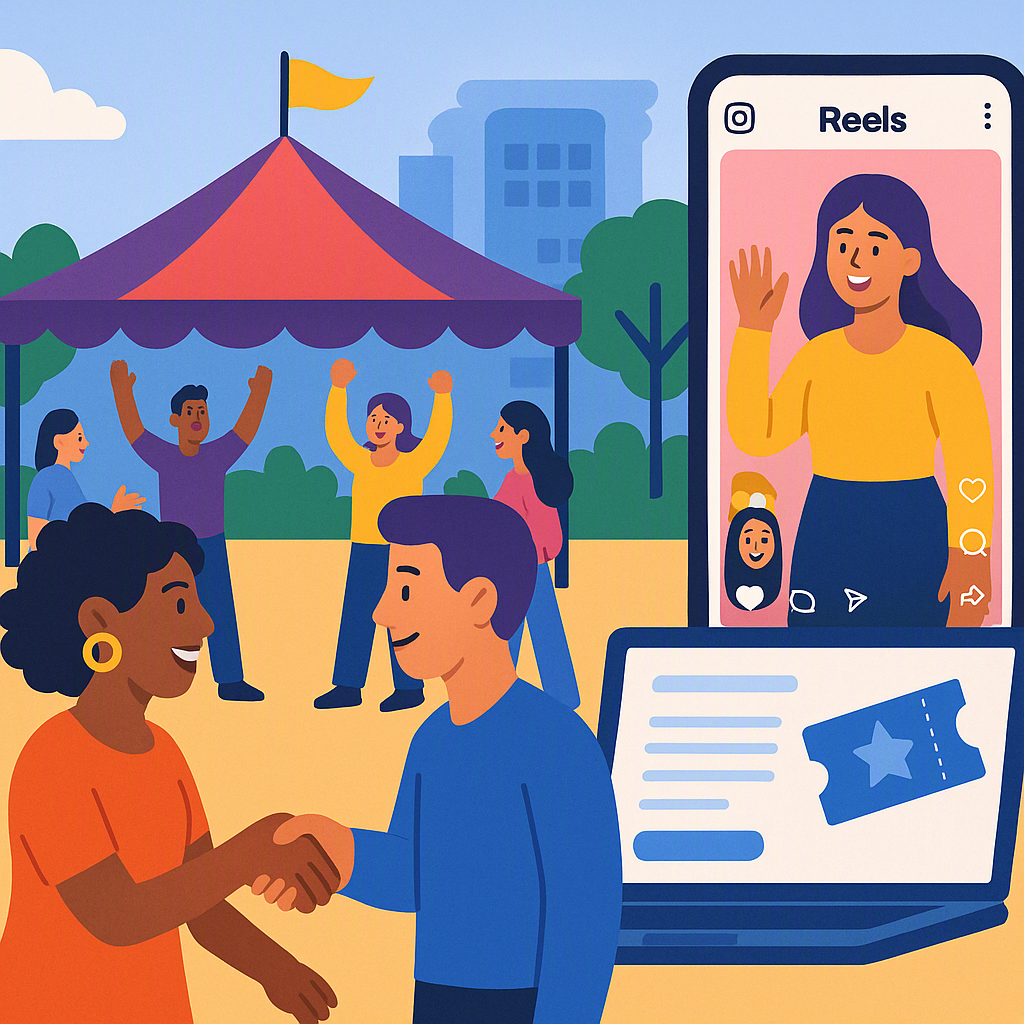
Even the best posters have limitations—they’re static. Once printed, you can’t update them with new details or sell tickets directly. That’s why pairing a physical poster with a dynamic event page can be a game-changer.
How Digital Event Pages Help:
- Upload Your Flyer: Use your event page to host a digital version of your poster.
- Add More Info: While your physical poster needs to stay minimal, your event page can include all the extra details—like FAQs, speaker bios, or a schedule.
- Drive RSVPs or Ticket Sales: Unlike static posters, your event page can collect RSVPs or ticket payments instantly.
Illustrative example — Let’s say you’re hosting a cultural festival. Your poster grabs attention with bold text and a vibrant image. The QR code leads to your event page, where attendees can learn about performances, view a food vendor list, and RSVP.
5. Test Before You Print
This step is often skipped, but it’s crucial. Before you commit to 100 printed copies:
- Print a Test Copy: Colors can look very different on screen versus paper.
- Get Feedback: Show it to 2-3 people who aren’t involved in planning. Ask them, "Would you attend this event based on this poster?" If they hesitate, refine it.
FAQ: Common Questions About Event Posters
Q: Can I use Canva for designing posters? A: Absolutely. Canva is beginner-friendly and has tons of free templates. Just customize them to match your event’s branding.
Q: What’s the best size for a printed poster? A: For community events, A3 or 11x17 inches works well. It’s big enough to stand out but not so large that printing costs skyrocket.
Q: Should I include sponsors on the poster? A: Only if they’re crucial to the event. Otherwise, list them on your event page to keep the poster clean.
Q: How early should I start distributing posters? A: For small community events, 4-6 weeks in advance is ideal. Too early, and people forget. Too late, and it’s hard to build momentum.
Final Thoughts
A great event poster isn’t just about looking good—it’s about driving action. Focus on clarity, visuals, and a strong CTA. And don’t forget: pairing your physical poster with a dynamic, mobile-friendly event page can make all the difference.
Need a simple way to manage your event promotions and RSVPs? Get started with CommunityTix today →